Craftnote App User Management
About the project
The goal of this project was to improve the user management of the teams inside the craftnote app.
Kick-off: Alignment, information gathering & ideation
For the kick-off I visited the team in their office. We used this opportunity to get alignment on the context of use and the topic at hand as well as for sketching out first solution drafts together on a multitouch screen. I like this style of working, because I always feel like that it is way easier to understand each other and to make sure eferybody is on the same page if you work on a visual level rather then just communicate with words. The results of that session were my starting point for my following work on the app.

Researching interaction patterns
For me it is important to make sure that I am not reinventing the wheel when it comes to common interaction patterns. That is why I like to start of with researching these commonly used patterns. It is always fascinating to me how we are very used to working with these patterns as users, but when tasked to figure them out in the context of a new app or feature, we feel like we have never seen them before. I have noticed that time and time again with my students and it is still true for me after many years of designing apps. So I tend to do this kind of research from time to time again and not blindly rely on my knowledge.
Wireframing & User flow
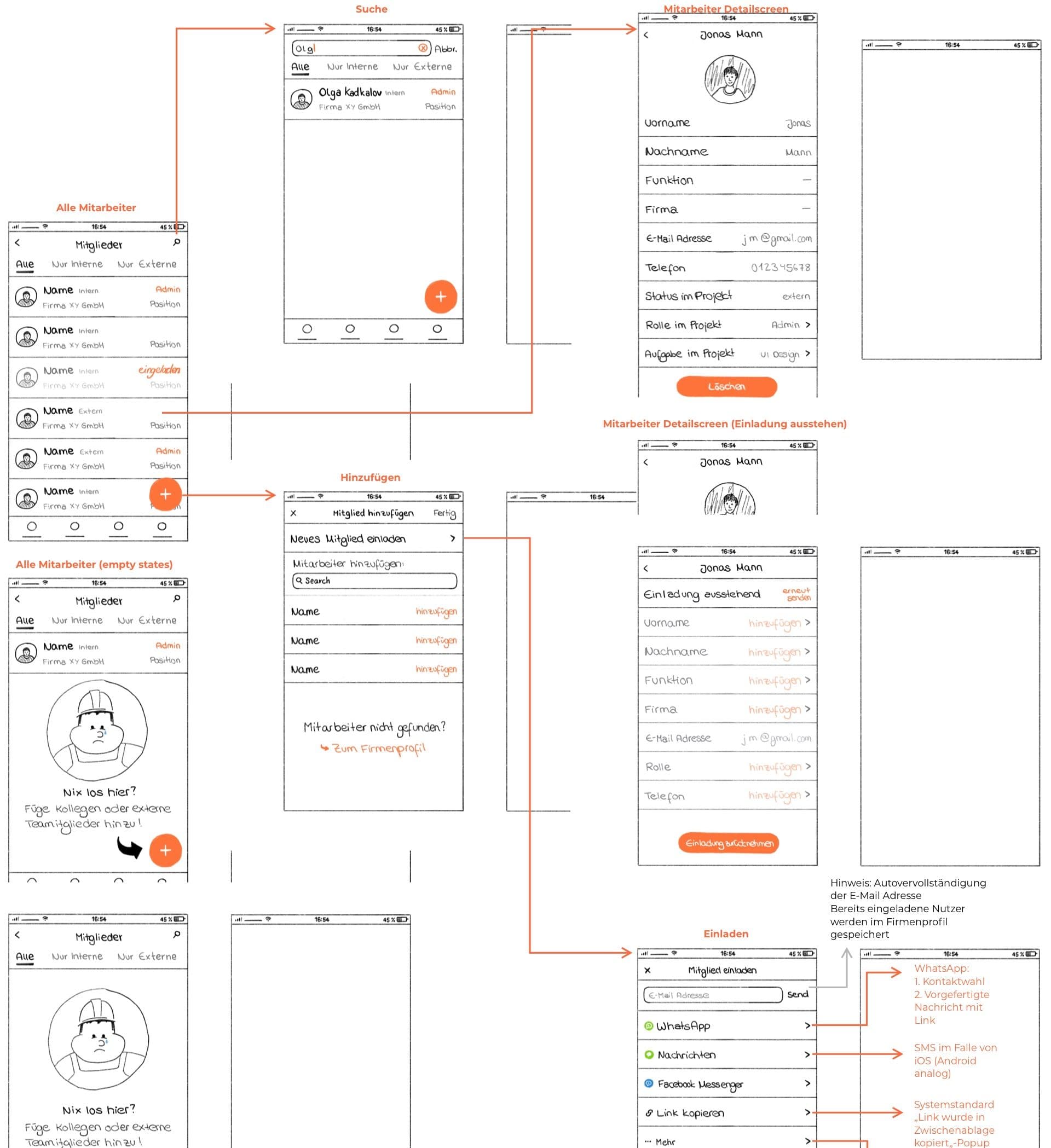
With that I quickly started wireframing and linking the wireframes together in a user flow. There were several rounds of this, always with regular check ins with the prooduct team who is in constant contact with their users.

UI Design
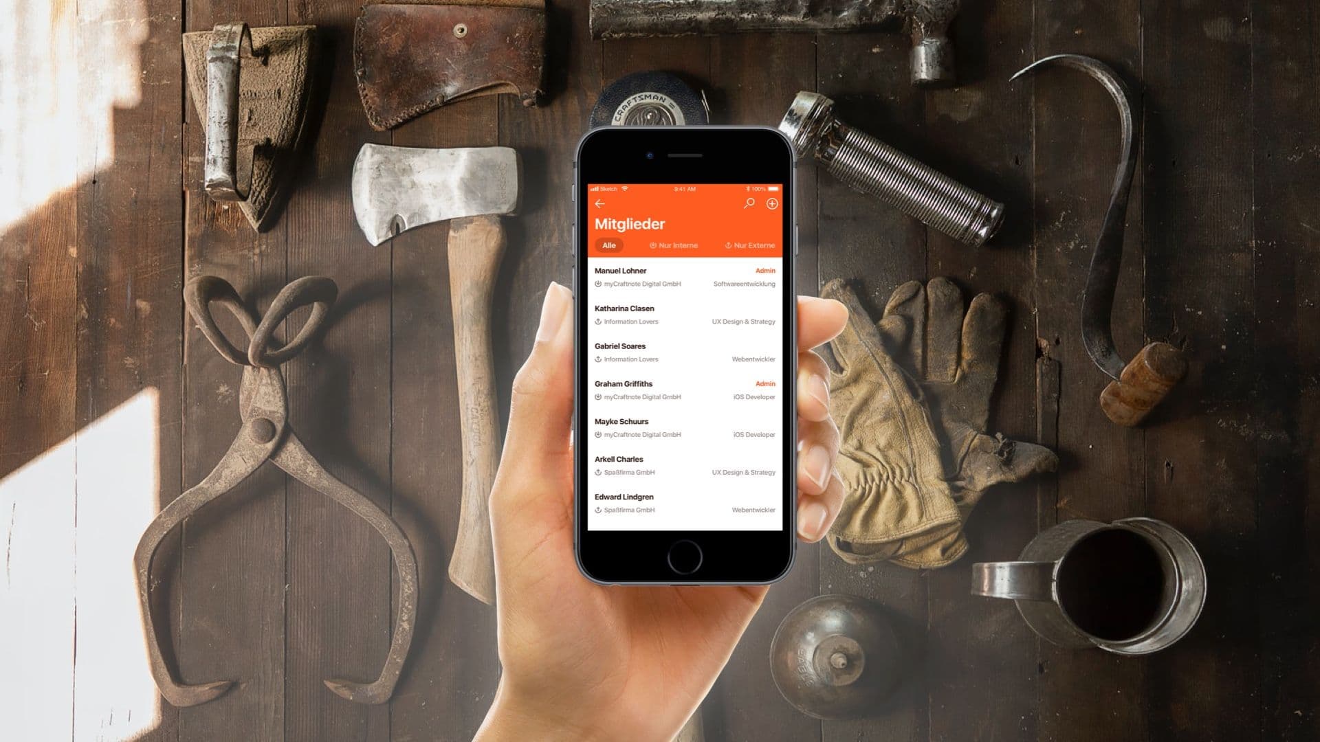
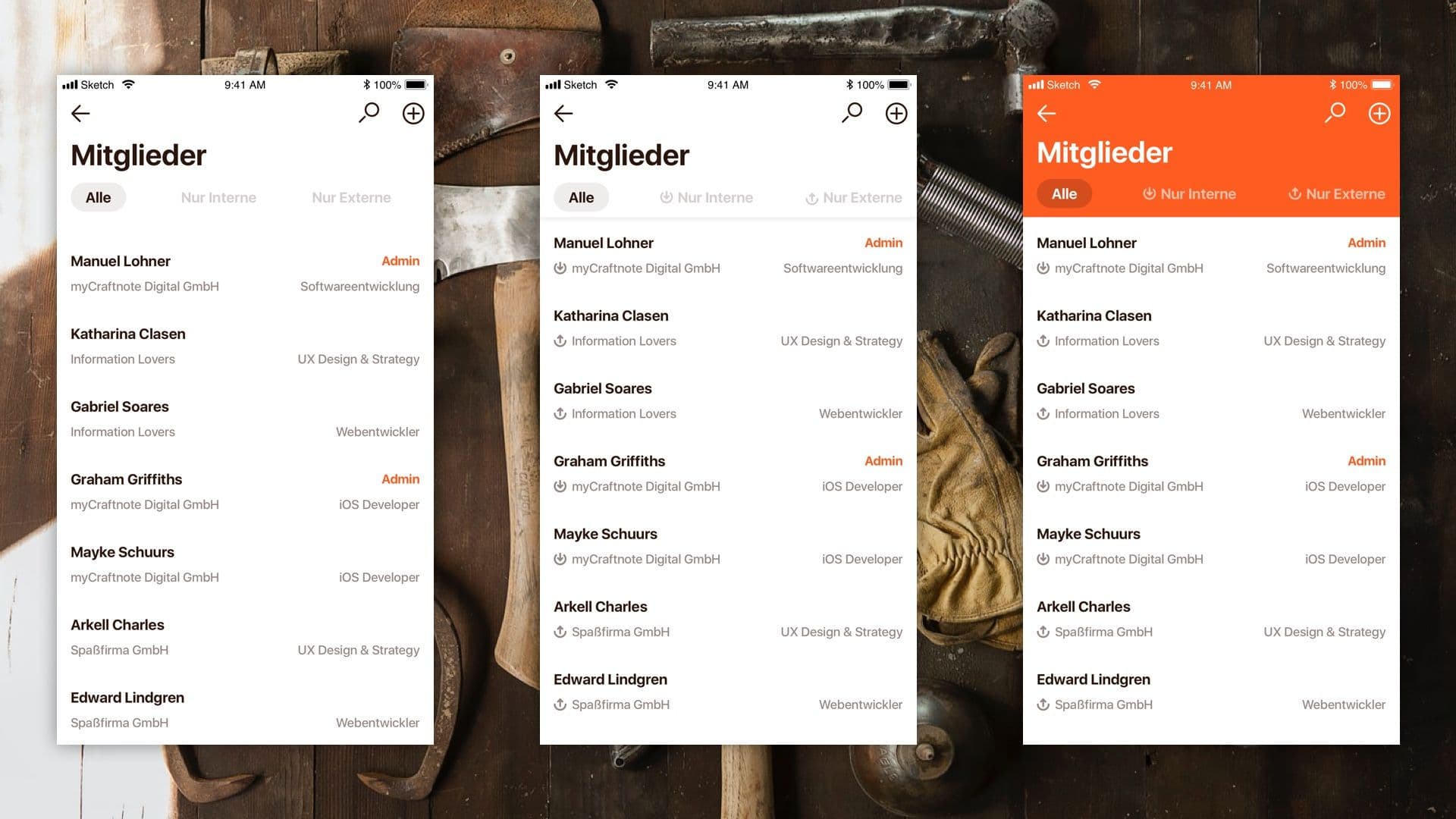
With the Wireframes my part was done, since I was only tasked with the UX Design part of this project and the UI Design was done by another agency. But I created some UI Design drafts anyways to show the team what this could feel like inside the craftnote app.
