homee Diary
About the project
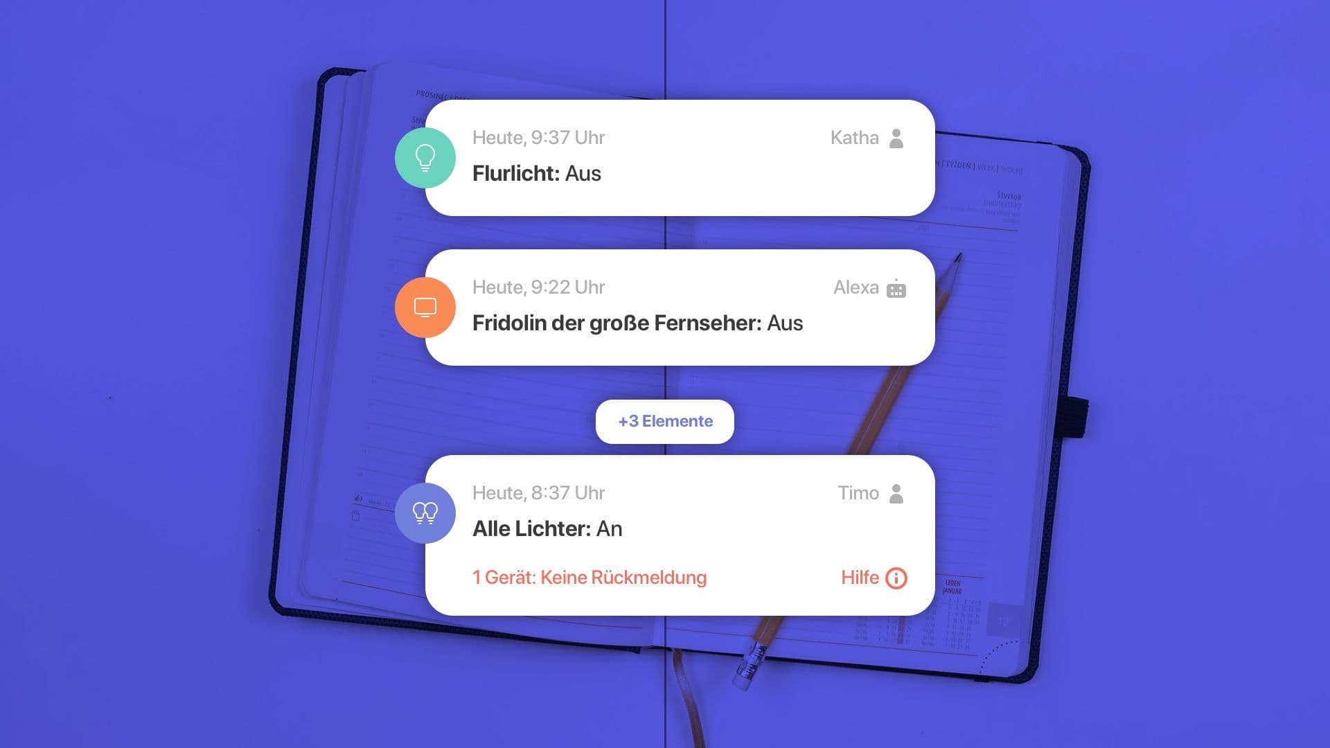
The diary feature inside the homee App is one of the functionalities that the community asked for for a long time. So the team behind the product knew it was time to serve this need.
But here is the important distinction to be made: It is not about blindly implementing want the users ask for. It is about recognizing that there obviously is an unmet need and figure out what exactly it is and how to best solve for it.
In this case, what the diary is supposed to provide is an overview over what is happening in the user's homes. It is supposed to fullfill the need for control – more precisely to know why certain things happen, to be able to deconstruct errors and other events as well as to always be informed about warnings.
Kick-off: Alignment, information gathering & planing
In a quick Kick-off session with the homee product lead I tried to understand why the team is now planning to implement a "diary" into the homee app. I always use this to get a feeling for what the team already knows about the user needs they are trying to serve and their goals with the new feature. This also helps to get alignment on what we still need to figure out and what direction to take.
Desk Research
After I got a feeling for how much the team already knows about the context and user needs behind this new feature, I decided to only do a little bit of desk research inside the homee community. On top of that I tasked one of the homee team members with providing me with a set of typical scenarios in the context of the needs to be fullfilled by this new feature.
Jobs to Be Done
By that time I understood that the diary was supposed to enable the user to do two jobs as well as fullfill the following needs:
- Give the user a feeling of control over what is happening in their home by giving them an overview over the different automated as well as manual actions and notifications.
- Help with finding and solving errors by enabling them to comprehend what happened and resulted in the errors.
Mini-workshop
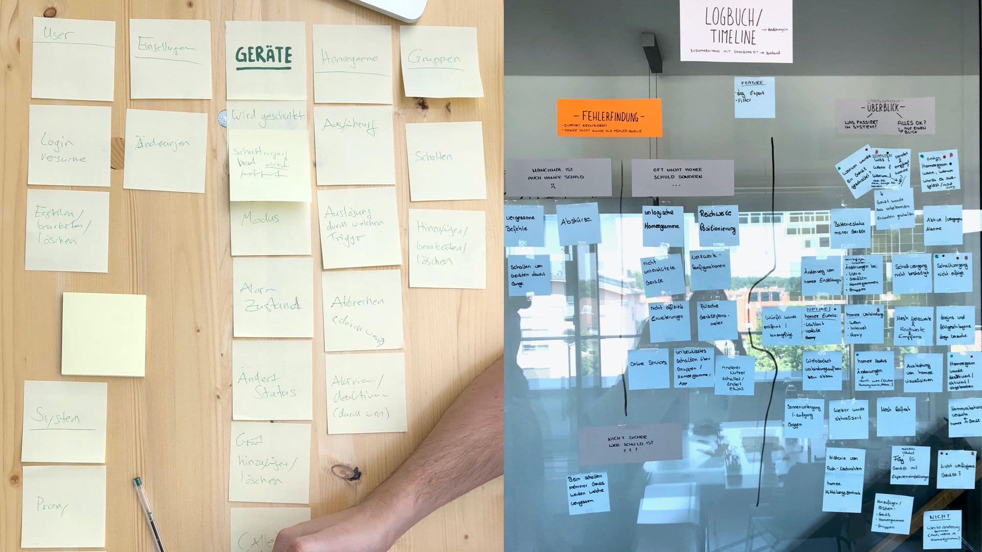
In order to dive deeper into the specifics of HOW to solve the user needs, I facilitated a Mini-workshop with both some front-end and back-end developers. Why? In this case the developers – employed at Codeatelier who is tasked with the development – are well aware of the user needs because they are in constant contact with them.
In this workshop I presented the team with my research results and facilitated an ideation session after we all had a good feeling for the context of use and the needs to adress.

Concept & Wireframing
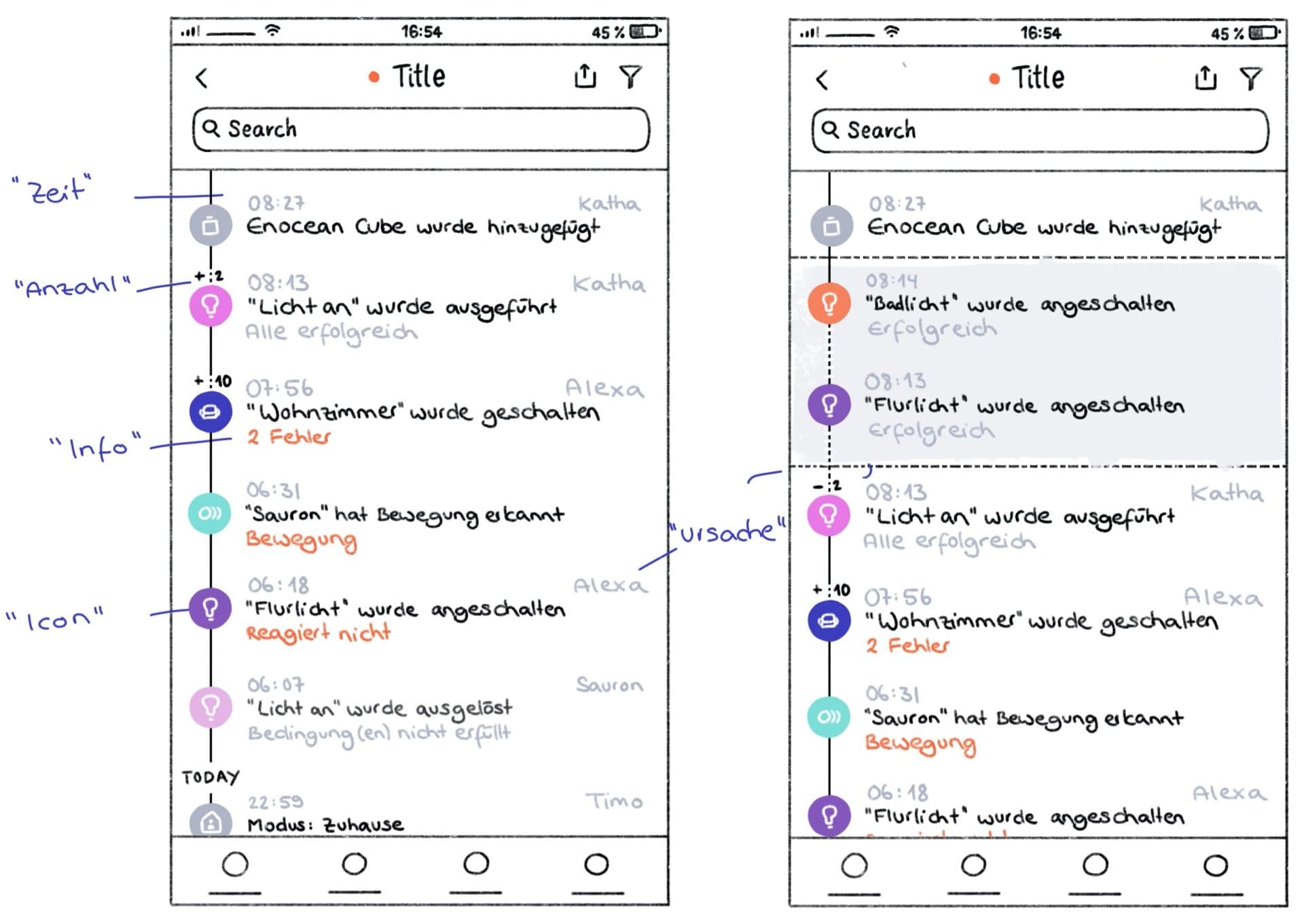
With the ideas from the ideation session and with some important insights I collected from the developers, I crafted a first version of the concept and created some rough scribbles. To convey my ideas I mainly relied on text – besides the mentioned simple wireframes.

UI Design
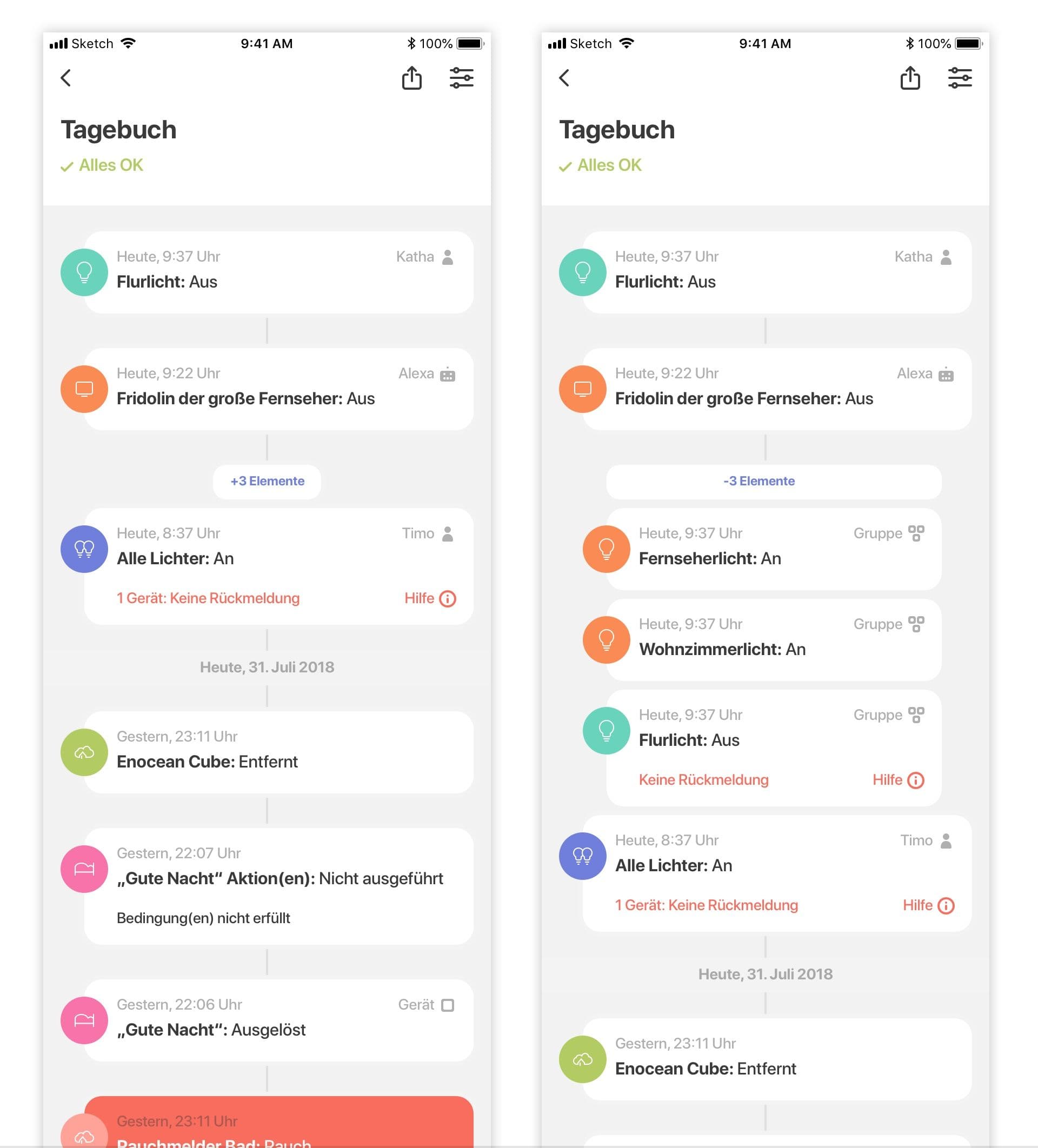
In a constant back and forth with the developers I quickly refined the concept to the point I felt confident to move to the high fidelity Visual Design in Sketch.
